Showing posts with label photoshop. Show all posts

Tuesday, 5 June 2012

Final Designs

The ground on all of the eight pieces has been made less obvious and slightly pixelated so doesnt take from the photos. The main part of the grounds is also in the bottom right which is where they are stood so they all look as though they are stood on a base.

Type droops with the way it is arranged. I have also used a full stop after the first line to add emphasis.


Gap between two lines smaller so they link together better. The expression on her face means she is in pain but she has her thumbs up as a confusion which shows a split personality. The lines on the ground is more crazy which matches the quote.


Type in corner works well as a step. Ground looks as though it has visual noise in it which matches the quote. 


White in top corner looks as though that's where the light is coming from and it also matches where the light in the photo is too. The type has also been arranged to look as though it is a silhouette stood in the corner ready to fight.


Removed capital 'E' on 'each' and aligned to the 't' on 'twelve'. The light coming from above works well because it is looking down. 


Moved the 'cos' into the column below because it isn't needed in the first line. 


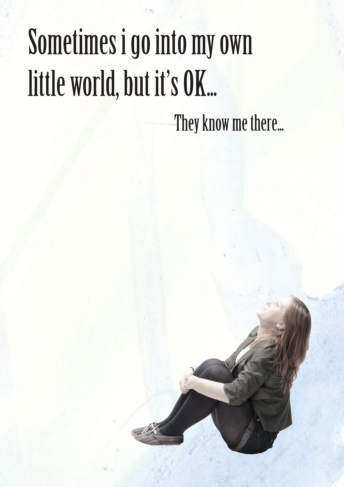
'Onto' means she is on her own little world. I have made 'they know me there' bigger so it links together better and remove the 'T' on 'They' 


Type works better in different sizes because second line acts as a comic punch line so it is better smaller because the focus is on the first line and split personality.

Tuesday, 29 May 2012

Grounds Black and White

For all of these images I have made the ground black and white which I think looks too dull. I think these images look as though they have had something spilt on the background because it is washed and not in colour. The grounds would look better if they were darker because they look dirty how they are. If they had a slight hint of blue to them then they might work better.


Photos Black and White

I think that having the photos in black and white makes the images look too dull and dark. I think that the use of light works better with the images in black and white but they would still look better if colour was used slightly in the images. 


3rd Final Ideas

Now i have decided to use blue grounds for all of my pieces I think they work well because they are all similar and linked.  

I have also used the type that I have decided on and rearranged the type in a way in which I think works best. The type still needs some edits but I think they are all close to being finished now.


The second line of type acts as a punch line.


Type looks as though someone is in the foreground waiting to fight and acts as a silhouette.


The gap between the type acts as a pause between the sentences.


Type has been boxed into the corner as if it is said with force?


Last bit is smaller as if whispered as a secret that they know her.


Type arranged as though it is drooping.


Type gets bigger towards the bottom of column. 


Second line of type too small?

Friday, 25 May 2012

Second Final Ideas

For all of these designs I have used the original photos which I think look better because they are less edited.  For each image I have used a quote which matches the image and links to split personality.


This image has too much type on top which I think could be made shorter by removing some words but it would still say the same.


The photo in this image needs to be made brighter so he can be seen with fists better. This will make the image clearer.


I think this design looks better with less type because it makes the image the main part of the design.


Type is just about right because it is in a step in the corner but I could try using a different type and size.


Too much Type? Could change size of type to look better or shorten quote? 


I think they type needs moving around because it looks too blocked into the corner and could also look better with a ground on it so there would be a base for the image.


I think that there is too much type in this piece or it need to be arranges better.


The type on this piece needs to be made shorter because it over powers the image.

All of these eight images would look better if they had a ground to them which would give them more of a base and look as though they are stood on something. 

All of these eight images look better and more natural using the original photos which means that they link together with the quote to be part of my split personality theme because the actions all look natural.

First Final Ideas

These designs are the first of my final ideas. I have used two images for each design to create opposites with the facial expressions and body language. I have added quotes to the top of each design to see how they work with the images created.


This image is obvious that it has been changed and is two put together because of the clear line between the head and body. It is also obvious because it is a girls body with a boys head added. I think the image would be stronger if it was just the original image used?


The type in the top of this image works well because it is in a clear step but I think the type needs to be smaller and the photo needs to be bigger. I think this image isn't obvious enough that I have added a head onto the body


I think there might to too much type on this image, or it is too big because it is too dominant on the image overall. I think that the photo could be made bigger so that it is the main focal point of the image.


The face on this is also obvious that it has been added. I don't think that adding different heads links them to split personality any more than using an original photo with the original head. 


This photo isn't obvious that it has been changed so I think it would be a lot stronger if I had just kept the original photo and let the type link them both to split personality. 


On this photo I have changed the type to make it seem more messed up. I think it would work well if there isn't a lot of type but if there were any more words in the quote it might be too much, so I don't think it is a good idea.

Sunday, 13 May 2012

Photoshop 2 Dogs Together

Today I used Photoshop to create the images i had planned in my sketchbook of mixing dogs up.

The first image I created was using two images of dogs off of the internet printed out then cut and stick them together in my sketchbook. I used the head of a boxer dog onto the body of a beagle with the head too big for the body. I think the image looks effective but would be better if two different coloured dogs were used to show more of a clear split.

I then used Photoshop to create my next image which used the head of a Great Dane and the tail of a grey hound. I think that as a piece of imagery it works well because of the difference in colour between the two dogs. I also think that the idea of a split personality works well because of the two halves. I think if I was to use this image as a final design for the jigsaw then I would need to remove the background or make it less dominant in the image.

The main reason I had added grass to the image was because the original photos of the dogs had grass on them and I couldn't Photoshop around the feet of the dog without the grass in the image so I tried to hide it by adding grass behind the image, if I were to use this as my final piece with white behind the image then I would need to use different dogs that were all in the image and didn't have the feet missing in grass.


The third image I produced was using the idea of a kind dog with nasty features so I used a Sheltie as the main dog and added boxer eyes and a spaniel nose to the dog. I think the image looks effective but wouldn't be obvious to someone who didn't know dogs and how the look. I think the image works well in having a split personality because it gives the dog features of two other dogs.

Saturday, 14 April 2012

Food Animations

I used the fruit idea with these two pieces to try and get the idea of Split Personalities across using facial expressions

For this idea I used a marker pen onto oranges to draw facial expressions onto them. I think these work well because I used the green core of the orange as a nose. I think that each expression works well because it is obvious what the expression is supposed to express.


For this idea I used Photoshop to add expressions onto toaster machines so that they looked as though they were alive. I used the front toaster to be the 'Split Personality' toaster and the back toasters to be on looking in shock. I think that this idea works well as a Split Personality piece because it shows the toaster split into two.


Steven Guarnaccia
I chose to do the idea of oranges based on the idea that Steven Guarnaccia used with these images. I think it gives a humorous side to the pieces.