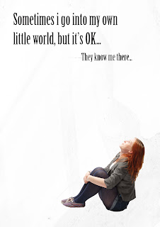
For all of these images I have made the ground black and white which I think looks too dull. I think these images look as though they have had something spilt on the background because it is washed and not in colour. The grounds would look better if they were darker because they look dirty how they are. If they had a slight hint of blue to them then they might work better.


No comments:
Post a Comment