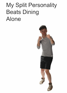
This image is obvious that it has been changed and is two put together because of the clear line between the head and body. It is also obvious because it is a girls body with a boys head added. I think the image would be stronger if it was just the original image used?
The type in the top of this image works well because it is in a clear step but I think the type needs to be smaller and the photo needs to be bigger. I think this image isn't obvious enough that I have added a head onto the body
I think there might to too much type on this image, or it is too big because it is too dominant on the image overall. I think that the photo could be made bigger so that it is the main focal point of the image.
The face on this is also obvious that it has been added. I don't think that adding different heads links them to split personality any more than using an original photo with the original head.
This photo isn't obvious that it has been changed so I think it would be a lot stronger if I had just kept the original photo and let the type link them both to split personality.
On this photo I have changed the type to make it seem more messed up. I think it would work well if there isn't a lot of type but if there were any more words in the quote it might be too much, so I don't think it is a good idea.


No comments:
Post a Comment