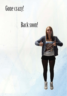
I think this image doesn't need any final changes. The text is arranged so it 'droops' with the image which links them together.
I think that the only changes needed on this photo would be that the 'Gone crazy!' and 'Back soon!' need to be made closer together so that they read better.
I think that the text layout on this image works well because it is blocked into the corner and there are certain words emphasised so that it is read with them as shouting.
The text in this image works because it could be acting as a person to be having a fight with because it is in a column.
On this image I think that the only changes needed are that the 'E' on 'Each' needs to be made lower case and then lined up with the 't' on 'twelve'.
I think this image would look better if the 'cos' was moved down into the column below and made slightly smaller.
I think there are still too many words in this image so I am going to remove the 'but its OK' and but the second line to read with 'but' at the beginning, I am also going to remove the capital from the 'They' on the second line so it reads as one.
I think the text layout on this image works well so I am going to keep it as it is.


No comments:
Post a Comment