Monday 19 December 2011

Artist Research- David Fullarton

 One Artist that i think is interesting is David Fullarton. I love how he used what could be scrap paper to create some really interesting Graphical Pieces. I love how he uses different type and grounds to create what from a distance could be seen as a quickly and unthought piece of graphics but when looking closely his pieces are really interesting and the text he uses can be humourous which gives him an edge that some other artists havent got.


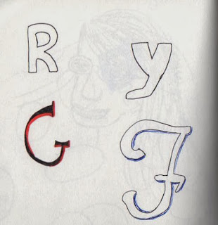
With this piece I have used the theme of scrap paper to make the work more interesting, on each different piece of scrap I have used a different type so that the theme follows that of David Fullarton.


Sunday 18 December 2011

Graphics- Shopping and Logos- Week 2

In week 2 of the project we were using the 140 images collected and creating our own pieces of Graphics Design with them. I struggled to start this because I wasn't sure how to interpret my ideas into Graphic Design. I started by recreating some of the images and merging them together for inspirational ideas which worked really well because i got 10 pieces of Experimental pages from this which were using Photocopies and Collage of my drawings and pictures.

In the 5 double page pieces I used more text than in my experimental pieces to make them more graphical. Out of the 5 I think that the 'Claire's' page is best in terms of composition because the use of negative space works well with the stencils of the pictures.

I found Photoshop quite hard to use initially because i hadn't used it properly before but once I had worked it out I found the images created really interesting. I tried to use ideas from my Experimental pages to link into my Photoshop so that the theme was kept.
10 Experimental Pages


5 Double Page, Interpreting Text


Photoshop


Tuesday 6 December 2011

Graphics- Shopping and Logos- Week 1

During Week one we did 140 observational drawings, Photography and found imagery. I thought this was a good chance to collect a wide range of images and materials that I could use in week 2. One thing i found was that my drawings were too sketchy and I had to change the style of drawing that I was using so that I used single continuous lines, this was so that the pictures would scan in easier and could be used easier. The theme I followed was shopping and logos because its what I see the main theme of Chesterfield to be. I went out into the town drawing shop logos and shop fronts and I also did some drawings of people shopping in the town. One thing that I didn't enjoy about the project was that the weather restricted a lot of the drawings that I wanted to do because it was raining/snowing most of the time which made it impossible to draw outside. Other than the weather I think that the first week was really interesting because we were drawing in public places and we were drawing a theme that interested us.