Workshop on typography, lettering and Layout.
Produce a series of square layouts that convey the meaning of 6 words, focusing on typefaces.
CASCADING
Anything that resembles a waterfall, especially in seeming toflow or fall in abundance.


I think that the first two images show the word cascading really clearly but the bottom one doesn't cascade as much as I think it should. If I was to do this again I would make the 3 layers on the bottom one more separate.
ENORMOUS
Greatly exceeding the common size, extent, etc.; huge;immense.


I think that these three pieces show the word enormous really obviously because they use big text. My favourite is the top right because the type that is being used shows the use of boldness and enormous clearly.
FATIGUE
Weariness from bodily or mental exertion.


When I did these three pieces I decided to make the text faint to show the exertion of the word. I think that the best one of the three is the bottom one because it shows the letters seem mixed up and just sat at the bottom of the page and not showing any energy.
SLIPPERY
tending or liable to cause slipping or sliding, as ice, oil, awet surface, etc.


I think that all of these images show the meaning of the word clearly because of the type that has been used. In my opinion the top left image is the best because the letters almost slip into themselves and look mixed up.
HYPERACTIVE
Unusually or abnormally active.


When I tried to interpret the word Hyperactive I decided that colour was needed because colour contains energy. I feel that the image that works the best is the top right because the words almost seem to move whilst looking at them because of the use of upper and lower case used alongside the colours.
ISOLATION
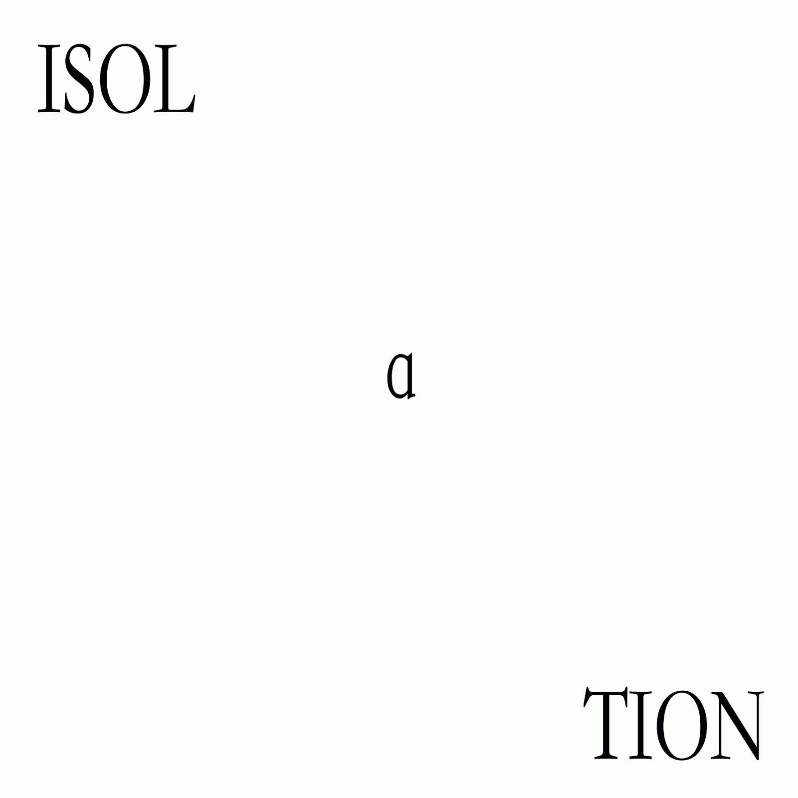


I think that when I did these images I decided that I needed to show the separation between the letters so
I tried to make them have a divide. The image that shows this the best is the top left. I think this because it shows the word split, whereas the others I tried to split it from the rest of the alphabet.