Friday, 30 March 2012

Questionnaire created


Today I have created my questionnaire and printed off copies which I will be handing out for people to fill in.

This is my questionnaire:

FMP PERSONALITY QUESTIONNAIRE
GRACE GENDERS
ANSWERED BY:                                           .

Describe your general mood in one word...                            __________
Describe your good mood in one word…                              __________
Describe your bad mood in one word…                                __________
What sort of moods do you have in mornings?                       GOOD/BAD
What sort of moods do you have at nights?                            GOOD/BAD
What makes you angry?                                                        __________
What makes you happy?                                                       __________
Pick which you would prefer in general…                               BLACK & WHITE/COLOUR
Which colour do you prefer?                                                 __________
Which colour do you hate?                                                    __________
What’s your opinion of your mood at work? In general…      __________
Given the choice which would you prefer to keep?                 HEARING/VISION
Finish this sentence… I am happiest when…                          __________
Finish this sentence… I am saddest when…                           __________
What’s your favourite food?                                                   __________
What’s your worst food?                                                        __________
What's your favourite drink?                                                   __________
What’s your worst drink?                                                       __________  
What weather do you like the best?                                        __________
What’s your favourite season?                                                SPRING/SUMMER/AUTUMN/WINTER
Where do you prefer to be?                                                    INSIDE/OUTSIDE
Which is the most importance to you?                                     COMFORT/IMAGE
What activity makes you the happiest?                                    __________
What activity makes you saddest?                                           __________
Which part of your body do you love?                                    __________
Which part of your body do you hate?                                    __________
Do you think that you have a split personality?                         YES/NO

Thursday, 29 March 2012

Questionnaire

Today I planned out and completed my questionnaire to ask people which will help me find out what peoples opinions on their questionnaires are. I have decided to include questions based on peoples views of themselves and what makes them happy and sad.
One thing I have to figure out is who I am going to ask my questions to. I can either ask the same person the same questions every day at the same time to see the variation of their moods, but I think if the person was to know I was doing this then the questions could be the same eventually.
I think the best idea was to ask a variation of people with different ages and sex and let them give my opinion on what they think their good moods and bad moods are in one word.
Tomorrow I will create my questionnaire and print them off ready to ask people.

Tuesday, 27 March 2012

Statement of Intent


In my FMP I plan to use photography, typography and colour, using Photoshop for editing and experimental pieces. I will theme my project around the topic of Split Personalities, and how people are all different. To help me develop my final outcomes I will plan out my designs using thumbnails and a range of experimental image-making techniques. Primary and secondary research as well as spider diagrams will help me when I am stuck for ideas in my FMP. My development will include different working processes that include collage, ink drawings and ‘being messy’ this will help keep my images loose and stop my work becoming boring and too precise. Using the theme of Split Personalities will be helped by my knowledge of studying psychology at A-level so the notes I have from that will help with my research for the project. I will also do primary research using questionnaires to find out how people view themselves and their personalities. My final outcomes will be creative and different; this will give my work a different edge that other graphic design doesn’t have.

Project plan

Week 1-2
Primary and secondary research using questionnaires and surveys for primary and books and the internet for secondary research.
Week 3
Research actors and celebrity icons that have split personalities
Easter Break and Week 4
Draw sketches in small journal that can be used and developed for final ideas; these can then be scanned in and manipulated.
Week 5-6
Develop original sketches into collages and ‘messy’ techniques.
Week 7-8
Developed thumbnails of final ideas using images already created.
Week 9
Create and develop further final ideas.
Week10
Finish final ideas and prep for exhibition.

Tuesday, 20 March 2012

Picasso

“Everyone wants to understand art. Why don’t we try to understand the song of a bird? Why do we love the night, the flowers, everything around us, without trying to understand them? But in the case of a painting, people think they have to understand. If only they would realize above all that an artist works of necessity, that he himself is only an insignificant part of the world, and that no more importance should be attached to him than to plenty of other things which please us in the world though we can’t explain them; people who try to explain pictures are usually barking up the wrong tree.” –Picasso

Friday, 9 March 2012

Typography Workshop Day 2

Workshop on typography, lettering and Layout.

Design a series of Typographical Layouts from a choice of idioms / phrases.

Idioms: a combination of words with a special meaning that cannot be deduced from its separate parts.

2 CAN PLAY THAT GAME

When you retaliate against someone in the same manner that they hurt you.


DOWN IN THE DUMPS

A gloomy, melancholy state of mind; depression.


LARGER THAN LIFE

A very strong or lively personality that impresses people very much.


STUCK IN A RUT

In a boring lifestyle that never changes.


TURN A BLIND EYE

To knowingly refuse to acknowledge something which you know to be real.

NEEDLE IN A HAYSTACK

Very difficult, if not impossible to find among everything around it.


VANISH INTO THIN AIR 

To disappear without trace.


KEEP AN OPEN MIND

To wait until you know all the facts before forming an opinion or making a judgment.


FALLING ON DEAF EARS

To be ignored by the persons they were intended for.


ON CLOUD NINE 

A state of elation or great happiness.

Monday, 5 March 2012

Typography Workshop Day 1

Workshop on typography, lettering and Layout.

Produce a series of square layouts that convey the meaning of 6 words, focusing on typefaces.


CASCADING
Anything that resembles a waterfall, especially in seeming toflow or fall in abundance.


I think that the first two images show the word cascading really clearly but the bottom one doesn't cascade as much as I think it should.  If I was to do this again I would make the 3 layers on the bottom one more separate.

ENORMOUS
Greatly exceeding the common size, extent, etc.; huge;immense.


I think that these three pieces show the word enormous really obviously because they use big text. My favourite is the top right because the type that is being used shows the use of boldness and enormous clearly.

FATIGUE
Weariness from bodily or mental exertion.


When I did these three pieces I decided to make the text faint to show the exertion of the word. I think that the best one of the three is the bottom one because it shows the letters seem mixed up and just sat at the bottom of the page and not showing any energy.


SLIPPERY
tending or liable to cause slipping or sliding, as ice, oil, awet surface, etc.


I think that all of these images show the meaning of the word clearly because of the type that has been used.  In my opinion the top left image is the best because the letters almost slip into themselves and look mixed up. 

HYPERACTIVE
Unusually or abnormally active.


When I tried to interpret the word Hyperactive I decided that colour was needed because colour contains energy. I feel that the image that works the best is the top right because the words almost seem to move whilst looking at them because of the use of upper and lower case used alongside the colours.

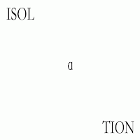
ISOLATION
to set or place apart; detach or separate so as to be alone.


I think that when I did these images I decided that I needed to show the separation between the letters so 
I tried to make them have a divide. The image that shows this the best is the top left. I think this because it shows the word split, whereas the others I tried to split it from the rest of the alphabet.

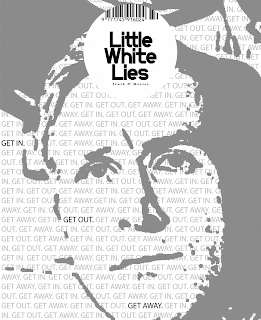
D&AD Student Awards 2012- Little White Lies

Create an original cover illustration for Little White Lies Magazine depicting the main character of the film 'Drive' 2011.


Not all of the images I created had a portrait in them because the area I am working in is Graphic Design so I tried to do some designs that interpreted type based on the themes or logo of the film.
My favourite ones are the top two, this is because the portrait contains type which is graphical but still follows the brief and the one with the cars is another favourite because it uses different drawing techniques other than just computer digital images.